
Work
Resume
About
Work
Resume
About
Work
Resume
About
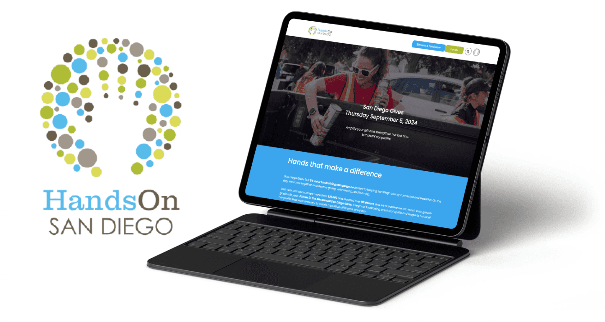
HandsOn San Diego
HandsOn San Diego
HandsOn San Diego
UX/UI Designer & Business Analyst
UX/UI Designer & Business Analyst
UX/UI Designer & Business Analyst
Timeline
Timeline
Timeline
July - September 2024
July - September 2024
July - September 2024
Deliverables
Deliverables
Deliverables
San Diego Gives Page
Click&Pledge Implementation
LinkedIn Revamp
San Diego Gives Page
Click&Pledge Implementation
LinkedIn Revamp
San Diego Gives Page
Click&Pledge Implementation
LinkedIn Revamp
Team
Team
Team
2 UX Designers
1 UX Researcher
1 Visual Designer
1 Marketing Strategist
1 Content Strategist
1 Project Manager
2 UX Designers
1 UX Researcher
1 Visual Designer
1 Marketing Strategist
1 Content Strategist
1 Project Manager
2 UX Designers
1 UX Researcher
1 Visual Designer
1 Marketing Strategist
1 Content Strategist
1 Project Manager
Context
As a part of Design Co's Upgrade program, I was paired with HandsOn San Diego, a local nonprofit that makes volunteering easier by connecting community members with opportunities and organizations. Our client was the HandsOn Program Director.
San Diego Gives is an annual fundraising event where the community comes together to uplift local nonprofits in a day of giving, and this year marks HandsOn's 4 year participating in this event. The design team was tasked with creating a new landing page for their fundraiser.
Context
The Challenge
The Challenge
How can we design a top-notch landing page that clearly conveys HandsOn's objectives and their fundraising instructions while inspiring volunteers to participate actively.
How can we design a top-notch landing page that clearly conveys HandsOn's objectives and their fundraising instructions while inspiring volunteers to participate actively.
Take me to the implemented site
Take me to the implemented site
Take me to the implemented site
Identfying problems
Identfying problems
Competitive analysis
Competitive analysis
Research
Research
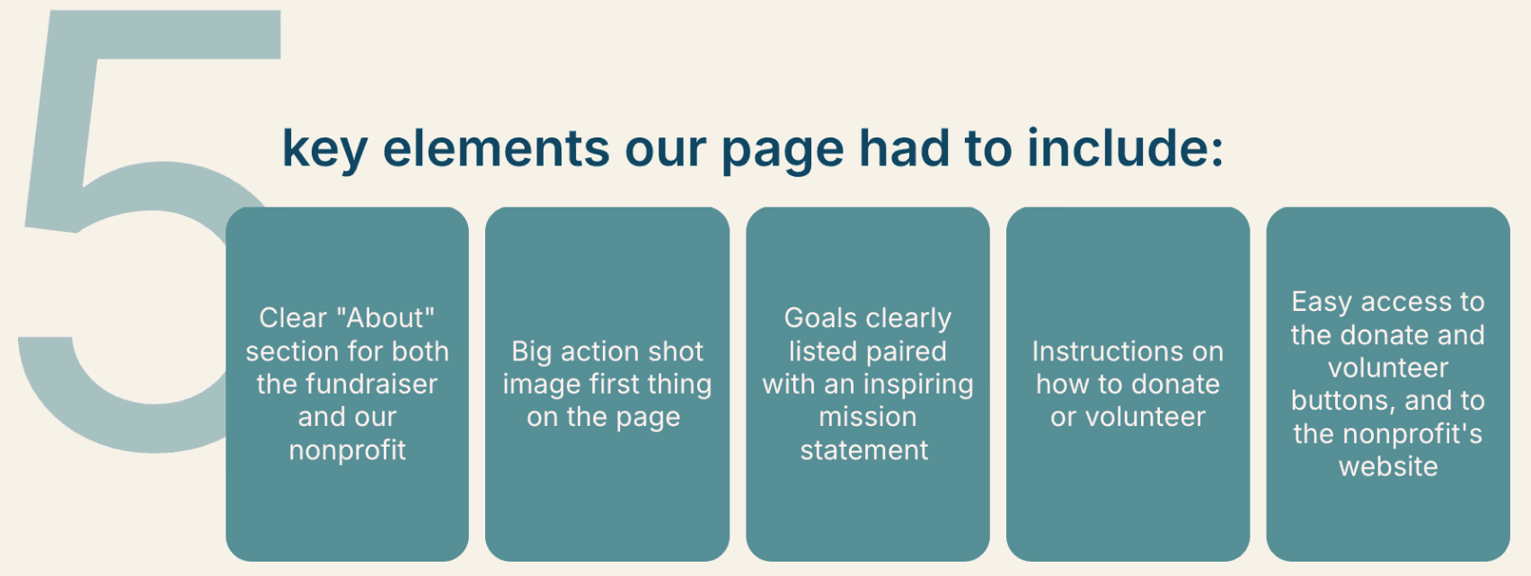
The existing fundraising page for volunteers was cluttered, needed a clear purpose, and lacked key information.
The existing fundraising page for volunteers was cluttered, needed a clear purpose, and lacked key information.
I didn’t clearly understand the fundraiser’s mission since the only information given was related to creating a volunteer account without any details about the actual event. In order to address this information deficit, we conducted a competitive audit.
I didn’t clearly understand the fundraiser’s mission since the only information given was related to creating a volunteer account without any details about the actual event. In order to address this information deficit, we conducted a competitive audit.
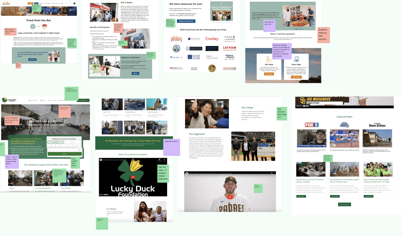
We compared the existing page to:
3 External Fundraising sites
Food from the Bar
Lucky Duck Foundation
Red Cross ADGP
3 San Diego Gives sites
North County Philanthropy Council
SD Gives Official Page
United Way
Through the audit, I learned the true reach and impact of San Diego Gives and how our own organization fit into the picture. This provided the clarification we needed for the content we could include in our own fundraising page. For each organization, their site was labeled with what the design team liked, disliked, and inspiring areas we could improve upon in our own design.
From the audit, I noticed key elements in every fundraising site and this greatly aided the wire frames creation.
Wireframes
Wireframes
Mid-fis
Mid-fis
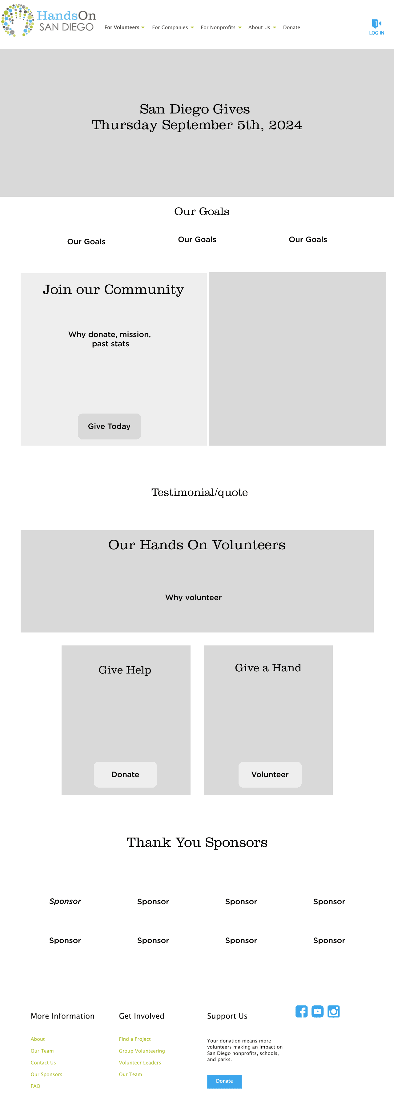
Hi-fis
Hi-fis
Design
Design
After synthesizing the results from our analysis, we created four wireframe designs in Figma to develop into mid-fi designs. I wanted to provide the client with different options, but not too many in case we overwhelm them, so my team and I eventually settled on four as our magic number.
After synthesizing the results from our analysis, we created four wireframe designs in Figma to develop into mid-fi designs. I wanted to provide the client with different options, but not too many in case we overwhelm them, so my team and I eventually settled on four as our magic number.
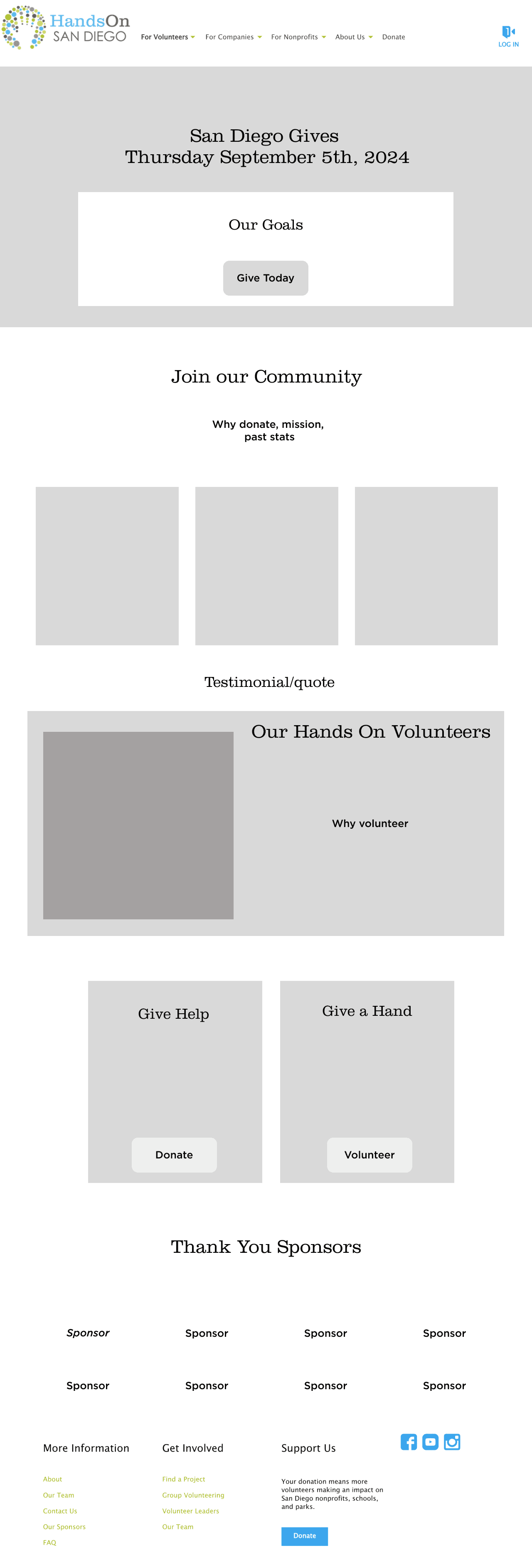
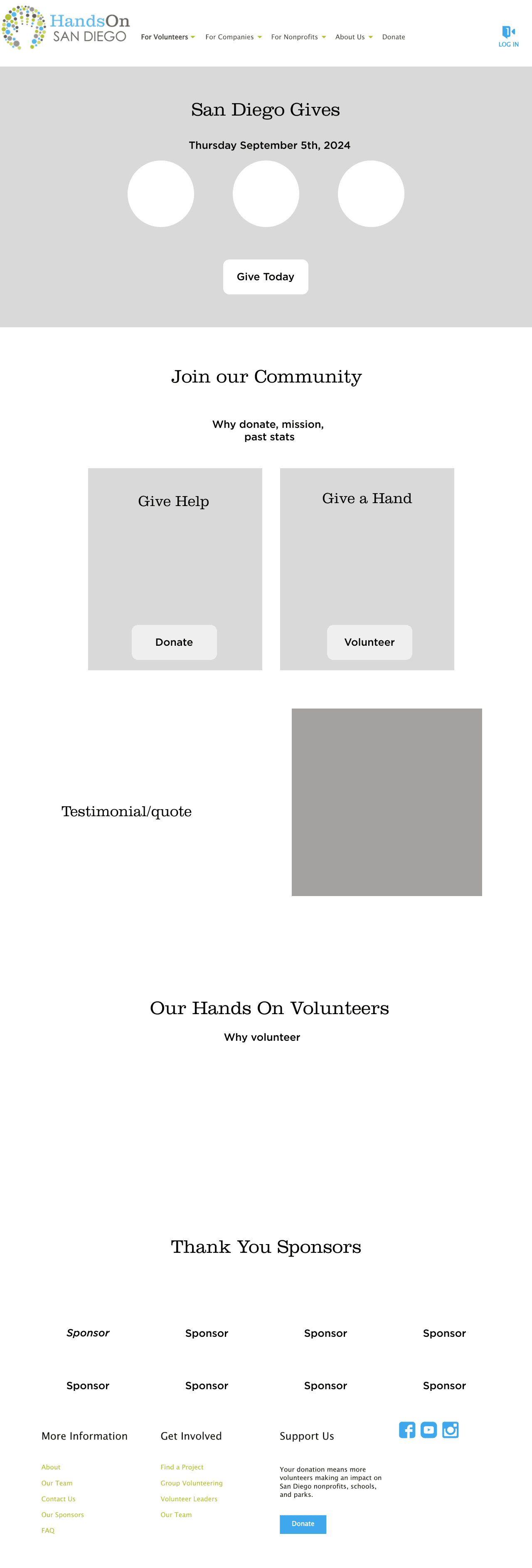
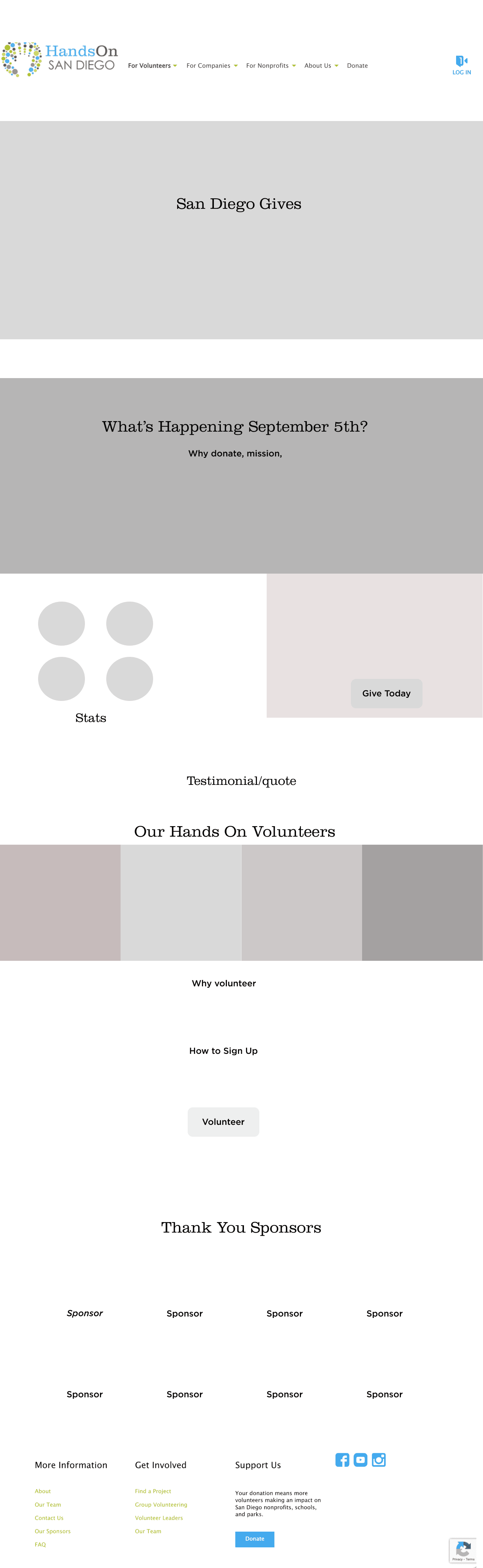
We created these low fidelity designs in four different formats with the key elements listed above so we could test out different features and layouts for the overall flow.
We created these low fidelity designs in four different formats with the key elements listed above so we could test out different features and layouts for the overall flow.
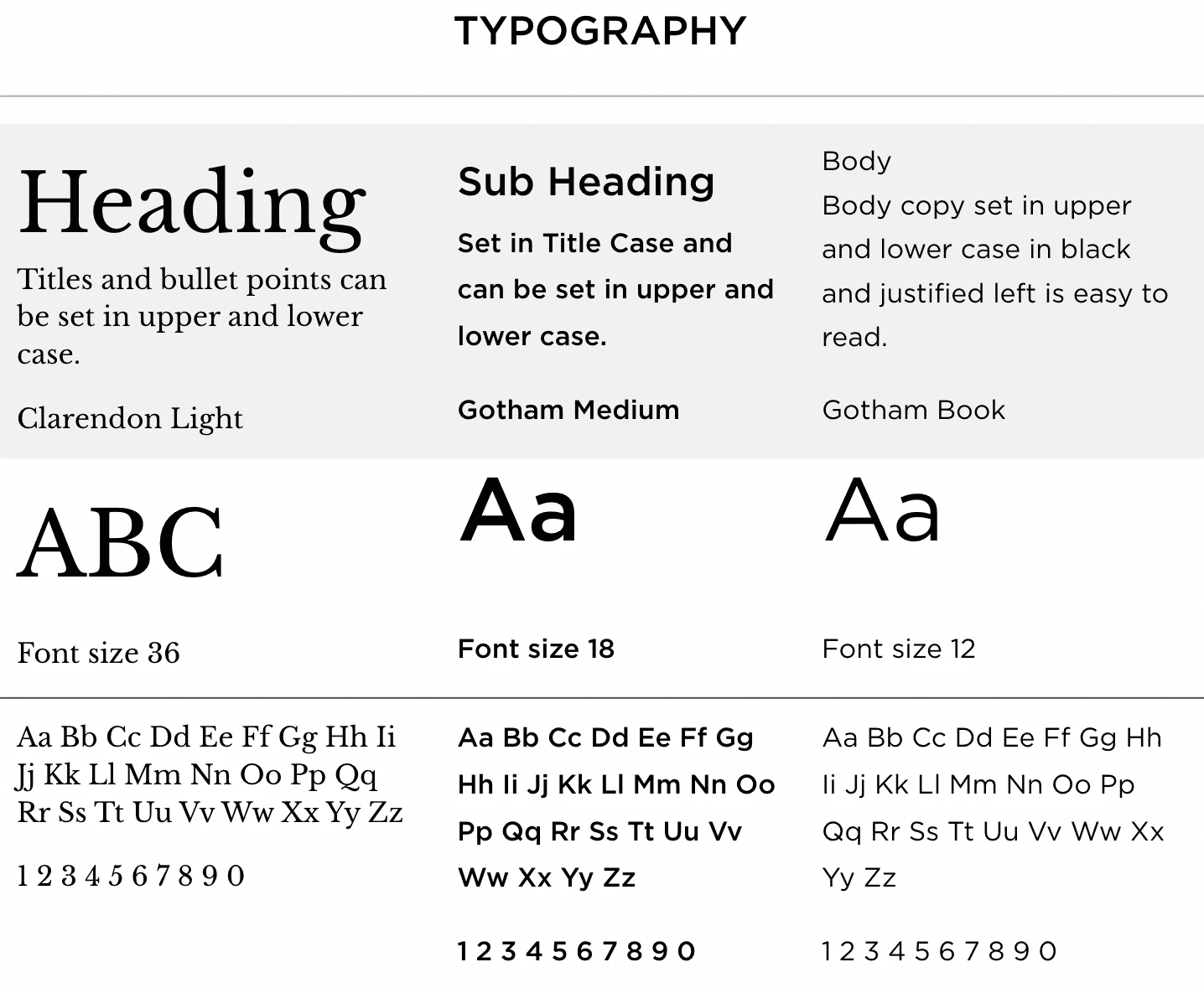
Branding Guidelines
Branding Guidelines
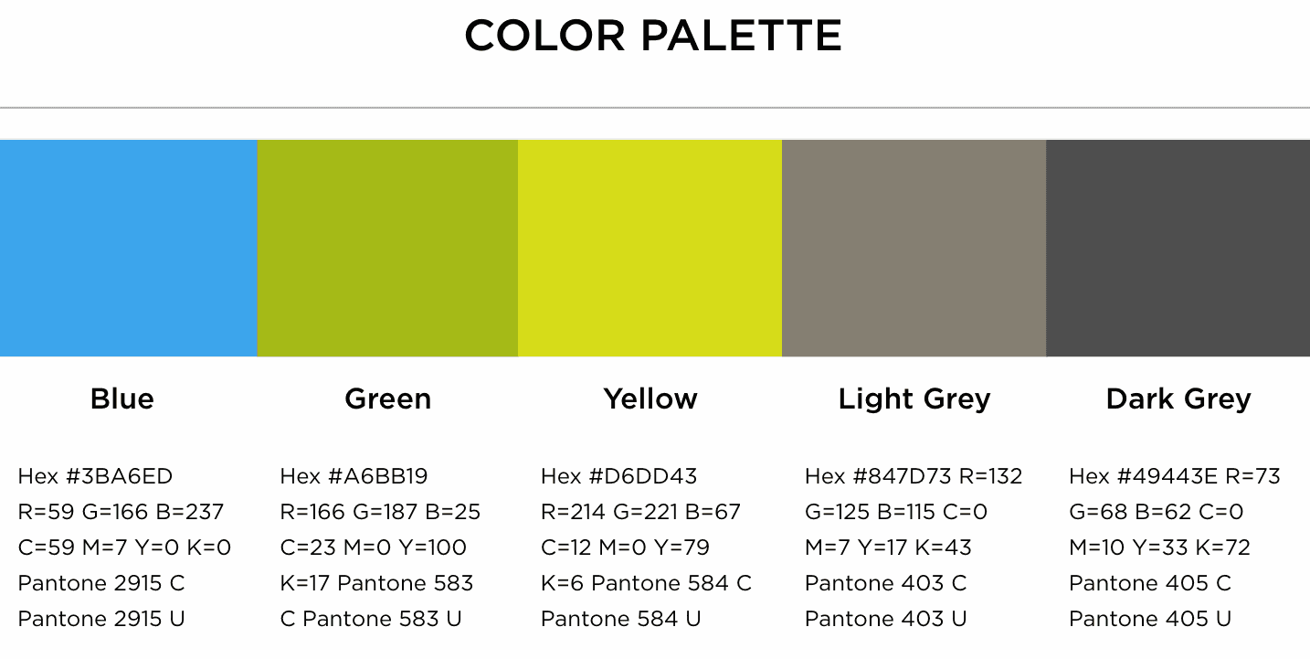
We utilized the existing branding guidelines provided by the HandsOn media kit on Canva.
AAA Requirements
AAA Requirements
AAA Requirements
Our style guide centered around the nonprofit's 5 main colors but played around with different opacities and overlays to ensure the contrast between our text and background passed the contrast checker and met AAA requirements.
Our style guide centered around the nonprofit's 5 main colors but played around with different opacities and overlays to ensure the contrast between our text and background passed the contrast checker and met AAA requirements.
Our style guide centered around the nonprofit's 5 main colors but played around with different opacities and overlays to ensure the contrast between our text and background passed the contrast checker and met AAA requirements.
Typography Changes
Typography Changes
Typography Changes
Our wireframe and mid-fi designs followed the typography provided in the kit. However, one of the technical limitations of the Click&Pledge site provided by SD Gives was the lack of fonts. In our later hi-fi and implemented designs, we use Poppins.
Our wireframe and mid-fi designs followed the typography provided in the kit. However, one of the technical limitations of the Click&Pledge site provided by SD Gives was the lack of fonts. In our later hi-fi and implemented designs, we use Poppins.
Our wireframe and mid-fi designs followed the typography provided in the kit. However, one of the technical limitations of the Click&Pledge site provided by SD Gives was the lack of fonts. In our later hi-fi and implemented designs, we use Poppins.
Feedback
Feedback
Team
Team
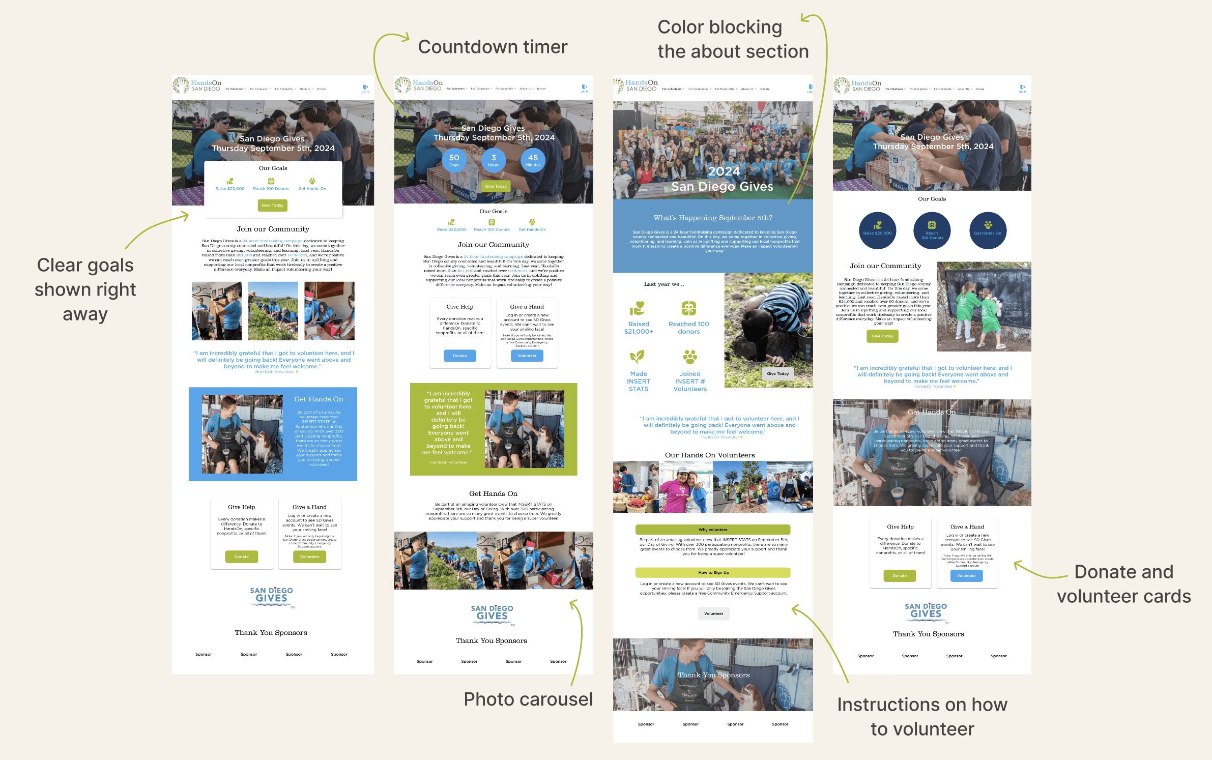
At the all hands meeting, members left a 🩷 if they liked the feature and a comment if they wanted a change. All members liked the volunteer cards, big image, use of metrics, and either the goals or countdown feature presented at the top. Some liked the "About" section with the overlay because the visual contrast was clearer. We received feedback on the different flows, with majority preferring this structure:
Countdown Feature —> Goals —> Volunteer Cards —> Testimonials —> HandsOn's Website —> Photo Carousel
At the all hands meeting, members left a if they liked the feature and a comment if they wanted a change. All members liked the volunteer cards, big image, use of metrics, and either the goals or countdown feature presented at the top. Some liked the "About" section with the overlay because the visual contrast was clearer. We received feedback on the different flows, with majority preferring this structure:
Countdown Feature —> Goals —> Volunteer Cards —> Testimonials —> HandsOn's Website —> Photo Carousel
Mentor
Mentor
Before the client meeting, our amazing mentor hopped on a Zoom call and provided extra feedback. Her main critiques were that the text was too lengthy, we needed more images to help the flow, and that our layout was too squished. She suggested we try different background colors and treatments to add color and depth to the page. Our mentor also suggested we ask our client for more updated metrics and specific details on the event so we could start personalizing our page ASAP.
Client
Client
We presented our client with the designs after we implemented the feedback from our team and mentor into three hi-fi designs. After she reviewed these designs, she chose two for us to implement into the provided site so we could test the different flows, alternate color blockings, and new features. At this meeting, she provided more metrics, the site login credentials, and an extra case study to use in our final design.
00:00:00:00
We were given two weeks to research and create a high fidelity design to present to the client, so for this reason we didn't create user personas. Our client has worked with HandsOn for 8+ years, so she had a good understanding of her volunteer base as well.
We focused on creating a design that targeted the high impact areas first. Although many sites had interesting designs and interactive elements, we were unsure who was in charge of implementing the design and where it would be implemented. For these reasons, we kept the design relatively simple to ensure a smooth design to developement handoff.
Click&Pledge
Click&Pledge
Implementation
Implementation
After getting the green light from our client, we transferred our designs over to the Click&Pledge site where we had to make many minor changes due to the technical constraints of the website. Click&Pledge had low customizability and strict sizing limitations which narrowed down the scope of what was possible to implement.
After getting the green light from our client, we transferred our designs over to the Click&Pledge site where we had to make many minor changes due to the technical constraints of the website. Click&Pledge had low customizability and strict sizing limitations which narrowed down the scope of what was possible to implement.
🔓 New Features Unlocked
🔓 New Features Unlocked
🔓
New Features Unlocked
Progress Bar
Donation Stats
Fundraising Profiles
New Buttons
Progress Bar
Donation Stats
Fundraising Profiles
New Buttons
Progress Bar
Donation Stats
Fundraising Profiles
New Buttons
🙅♀️ Scratched It
🙅♀️ Scratched It
🙅♀️
Scratched It
Countdown Timer
Photo Carousel
Icon usage
Countdown Timer
Photo Carousel
Icon usage
Countdown Timer
Photo Carousel
Icon usage
Through much trial and error, we were able to preserve most of our original design and utilized the new features to maximize our new designs. We had to completely scratch the timer feature and icons because these were not possible to implement onto the site and we had no access to the code.
The site had pre-made "Donate" and "Become a Fundraiser" buttons that would automatically reroute the user to the respective pages with pre-written instructions, which helped cut down the work for us. The carousel was modified into a photo panel that wraps up the page with action shot visuals.
Did you catch the change in the volunteer card titles? 🪄
Did you catch the change in the volunteer card titles? 🪄
We received feedback from our Project Manager during the implementation phase that the titles "Give Help" and "Give a Hand" sounded awkward, so we reworded them to say "Support Us" and "Lend a Hand" which flows better.
We received feedback from our Project Manager during the implementation phase that the titles "Give Help" and "Give a Hand" sounded awkward, so we reworded them to say "Support Us" and "Lend a Hand" which flows better.
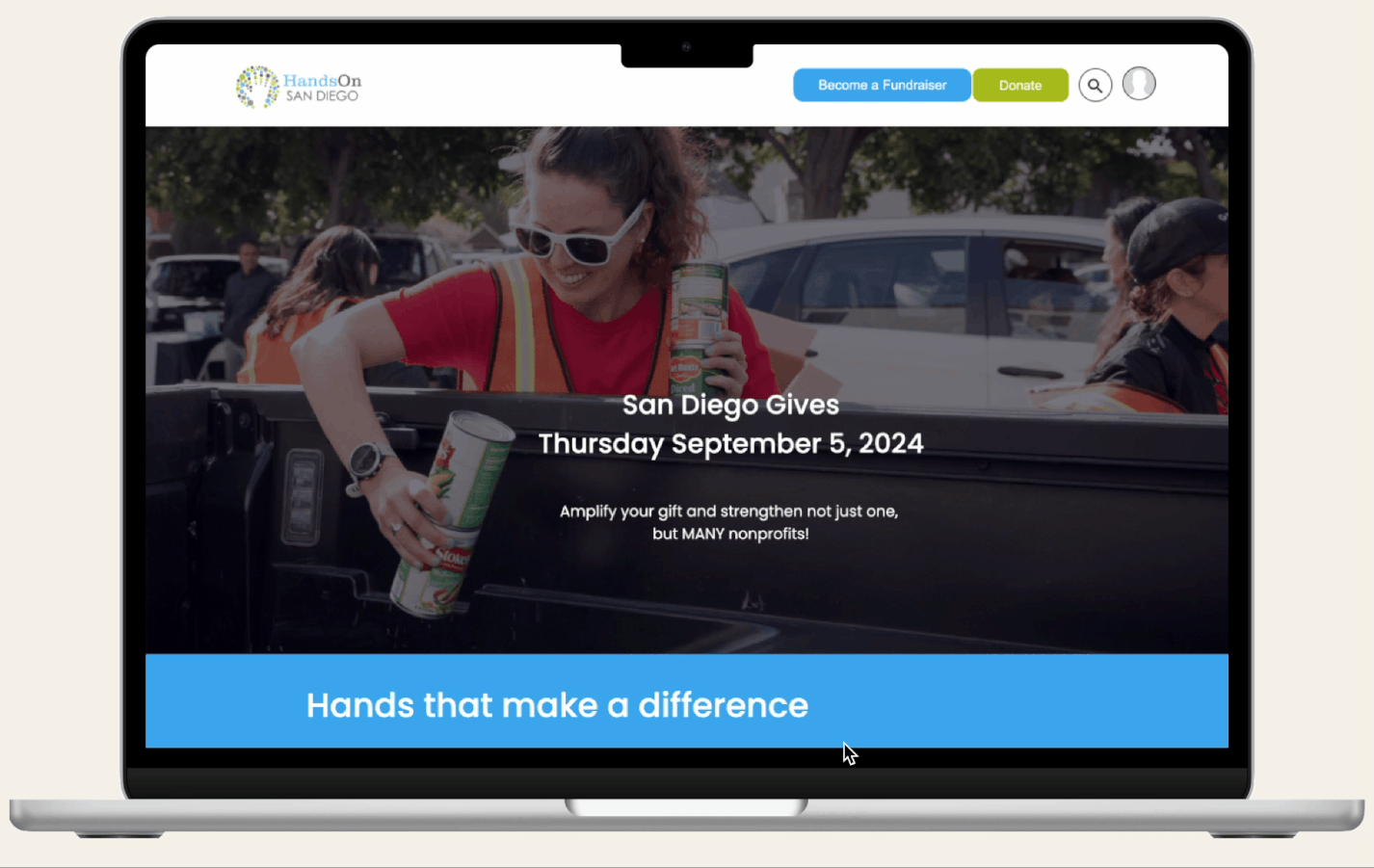
The Solution
The Solution
The Solution
Clear Goals
Clear Goals
Clear Goals
Our goal was to surpass the amount raised last year, so we implemented the fundraising bar to clearly show both our end goal and current progress. We surpassed our original goal of $20,000 before Sept 5th, so we moved the new goal to $30,000.
Our goal was to surpass the amount raised last year, so we implemented the fundraising bar to clearly show both our end goal and current progress. We surpassed our original goal of $20,000 before Sept 5th, so we moved the new goal to $30,000.
Our goal was to surpass the amount raised last year, so we implemented the fundraising bar to clearly show both our end goal and current progress. We surpassed our original goal of $20,000 before Sept 5th, so we moved the new goal to $30,000.
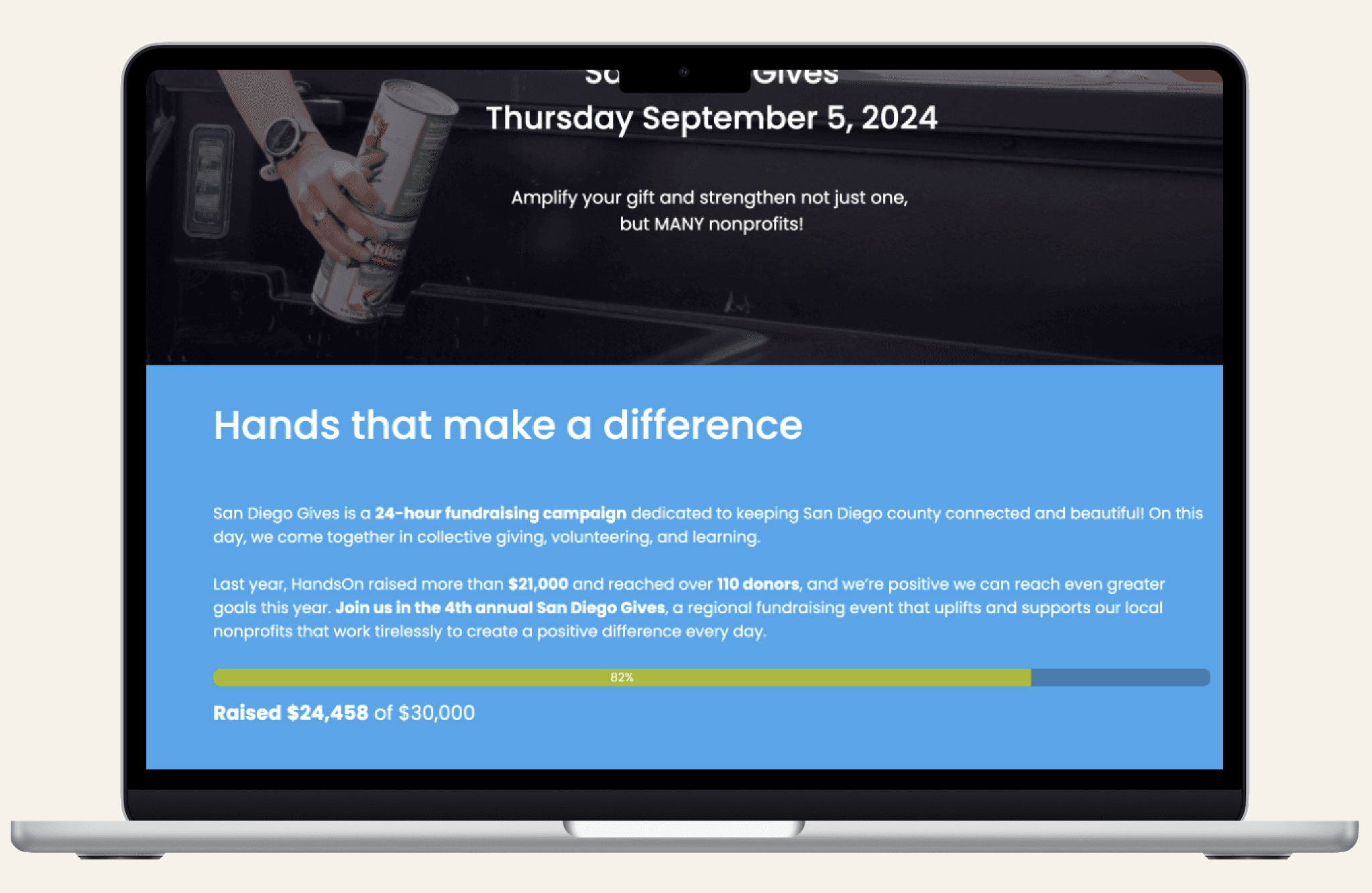
About section
About section
About section
Unsure what San Diego Gives is all about? The "Hands that make a difference" section clearly explains the event and encourages the user to join in by using high impact numbers and calls to action.
Unsure what San Diego Gives is all about? The "Hands that make a difference" section clearly explains the event and encourages the user to join in by using high impact numbers and calls to action.
Unsure what San Diego Gives is all about? The "Hands that make a difference" section clearly explains the event and encourages the user to join in by using high impact numbers and calls to action.
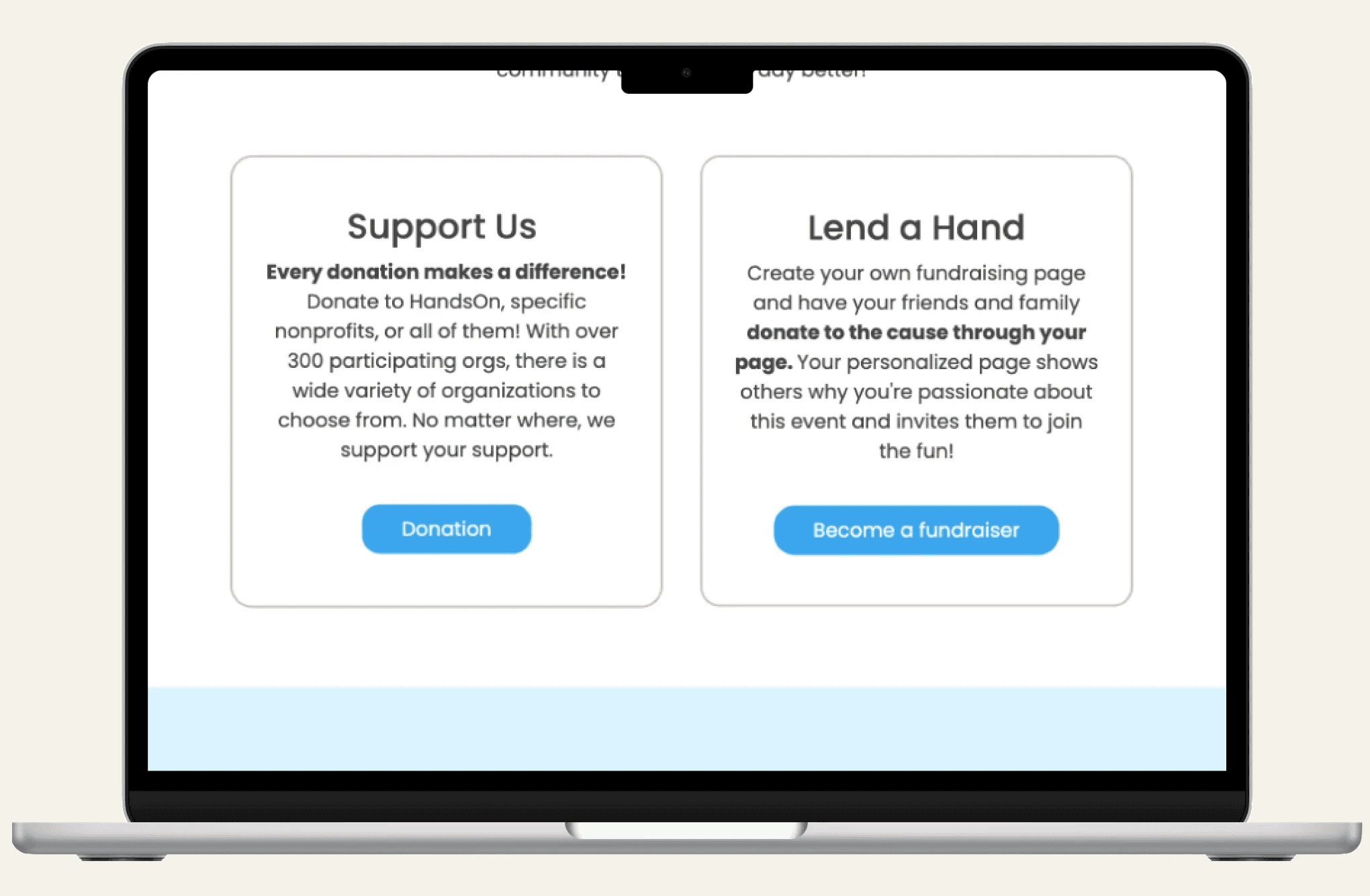
Volunteer and donation cards
Volunteer and donation cards
Volunteer and donation cards
We want as many volunteers as possible to participate, so we made it clear that people donate what they can. Both cards have buttons that take the user to a different page with clear instructions on how to become a donor.
We want as many volunteers as possible to participate, so we made it clear that people donate what they can. Both cards have buttons that take the user to a different page with clear instructions on how to become a donor.
We want as many volunteers as possible to participate, so we made it clear that people donate what they can. Both cards have buttons that take the user to a different page with clear instructions on how to become a donor.
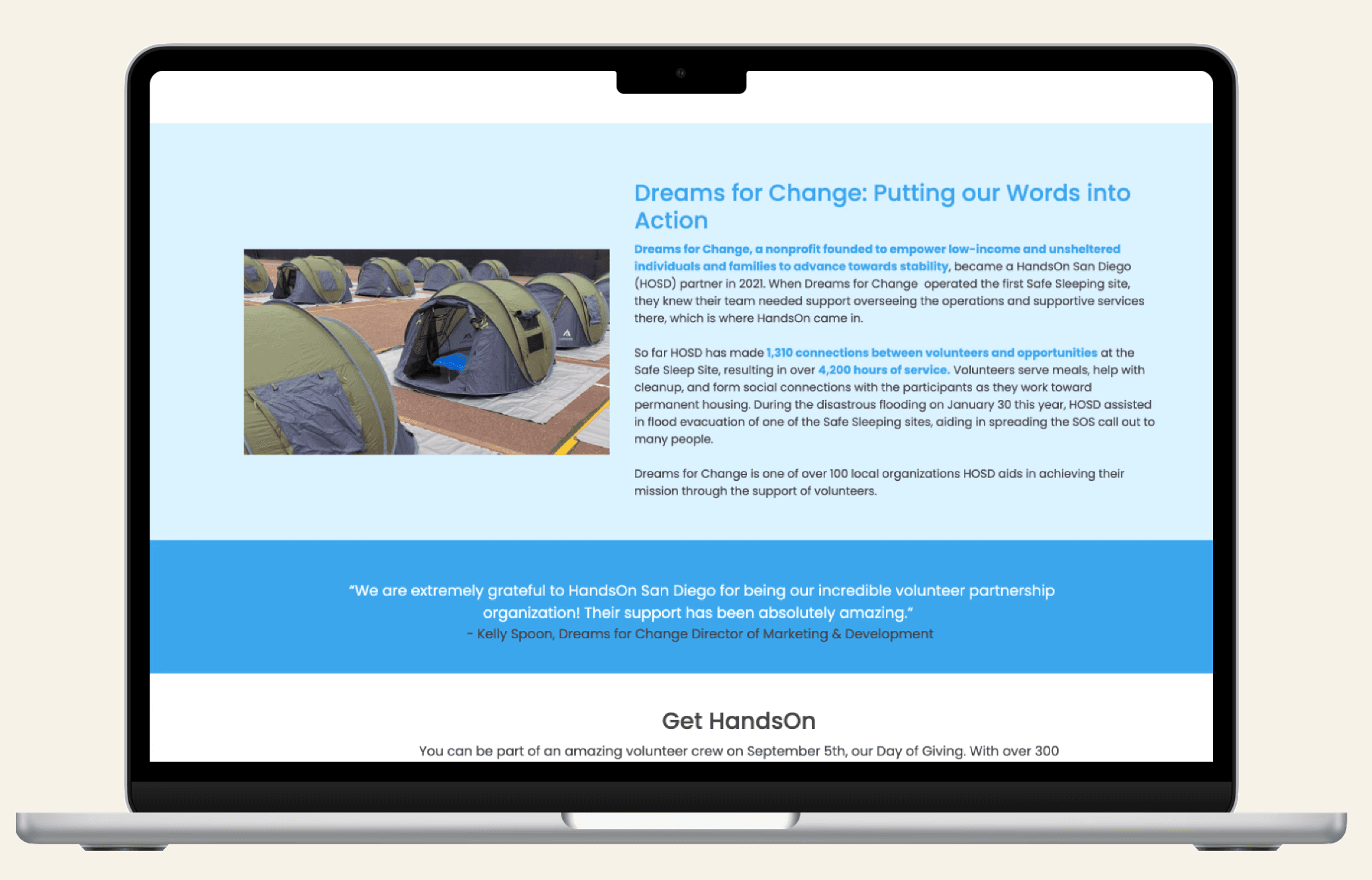
Case Study
Case Study
Case Study
Users may wonder: where does my donation actually go? The case study provides a concrete example of the positive work HandsOn is involved in, showing their donors exactly where their donation is going.
Users may wonder: where does my donation actually go? The case study provides a concrete example of the positive work HandsOn is involved in, showing their donors exactly where their donation is going.
Users may wonder: where does my donation actually go? The case study provides a concrete example of the positive work HandsOn is involved in, showing their donors exactly where their donation is going.
The Final Product
Implemented August 17th
The Final Product
Implemented August 17th
Business Analyst
Copywriting
Copywriting
SWOT Analysis
SWOT Analysis
LinkedIn Revamp
LinkedIn Revamp
Our team was flexible so each person wore many hats. In addition to design, I also conducted a SWOT analysis and LinkedIn revamp for the HandsOn LinkedIn with our marketing strategist.
Our team was flexible so each person wore many hats. In addition to design, I also conducted a SWOT analysis and LinkedIn revamp for the HandsOn LinkedIn with our marketing strategist.
Business Analyst
Copywriting
SWOT Analysis
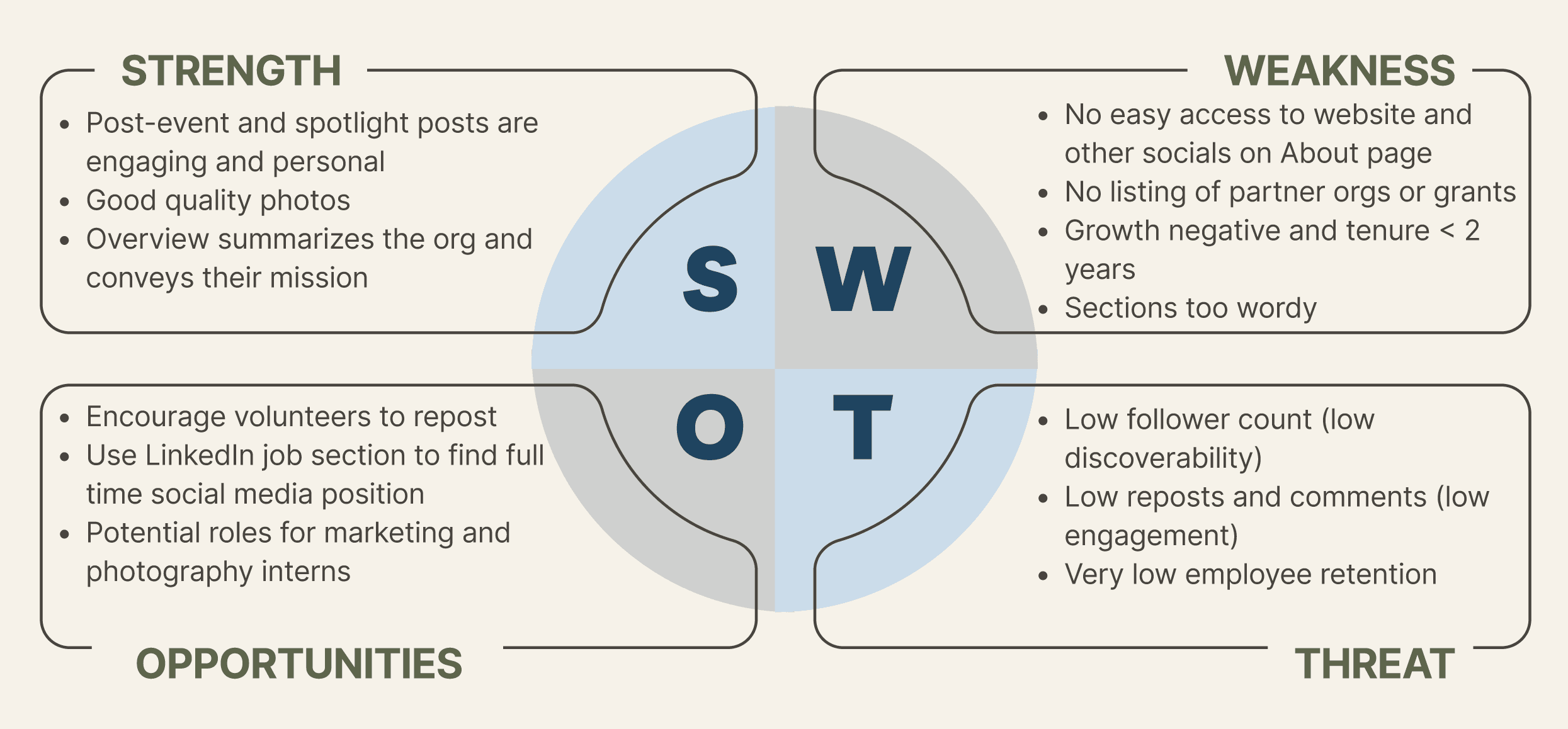
After a thorough analysis, we identified the major problem areas were in the low employee retention rates/ small staff and the "About" section as it was not digestible and did not link to the nonprofit's website or other social media platforms.
After a thorough analysis, we identified the major problem areas were in the low employee retention rates/ small staff and the "About" section as it was not digestible and did not link to the nonprofit's website or other social media platforms.
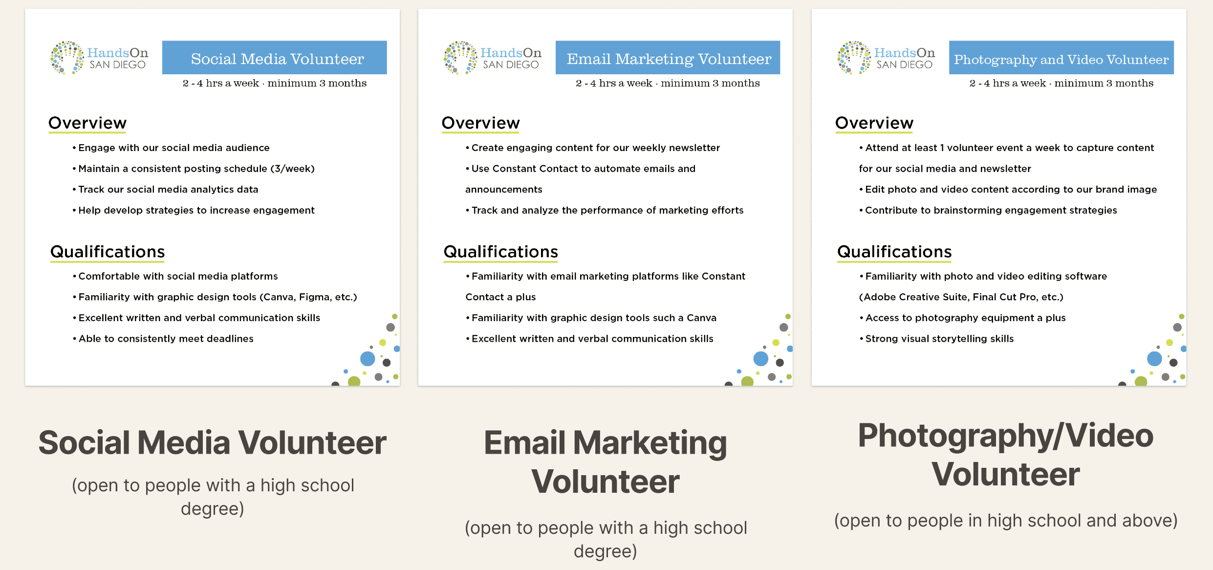
HandsOn's team was short-staffed and lacking a dedicated role for managing social media, newsletters, and event media coverage (photography & video), so we drafted some volunteer postings to target this deficit. These are supporting positions they can continue to fill in the future that also provide aspiring creatives the opportunity to gain professional experience.
HandsOn's team was short-staffed and lacking a dedicated role for managing social media, newsletters, and event media coverage (photography & video), so we drafted some volunteer postings to target this deficit. These are supporting positions they can continue to fill in the future that also provide aspiring creatives the opportunity to gain professional experience.
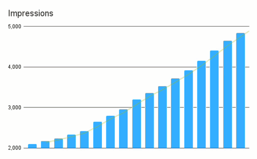
Of all three social media revamps, the LinkedIn team saw the most results.
Of all three social media revamps, the LinkedIn team saw the most results.
Clicks
+182%
Engagement Rate
+62%
Impressions
+158%
Clicks
+182%
Engagement Rate
+62%
Impressions
+158%
Constraints
Next Steps
Reflection
Wrapping Up
Wrapping Up
Acknowledging the project constraints
Time Crunch
We had to complete the final design in three weeks before the San Diego Gives website is live, so our design team had to skip parts of the design process, such as creating personas and proper user testing. While we were able to have our whole team test our prototype at each step, I want to acknowledge the shortcuts taken for this project.
Site Unknown
The design needed to be implemented to the site provided by official San Diego Gives organization, but this site was unknown to the designers until one week before the site went live. Therefore, our earlier iterations were designed for a site we assumed was more customizable and allowed access to the source code.